At Relligence, our brand is a reflection of our values, vision, and the trust we build with our audience. These guidelines are designed to ensure consistency across every touchpoint, whether it’s digital, print, or in-person interactions. By following these standards, we maintain a clear, professional, and recognizable identity that supports our mission and strengthens our connection with customers and partners. Please use these guidelines as a reference to help represent Relligence with clarity and integrity.
Logo Usage
Our logo embodies the fusion between the organic and artificial, an accomplishment made possible by Relligence Gutenberg™.
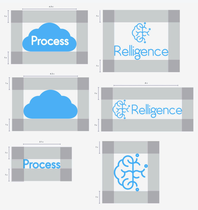
There are two available versions of the logo and icon together, vertical and horizontal. The icon can be used independently of the text, however the text should not be used independently of the icon.
Uses
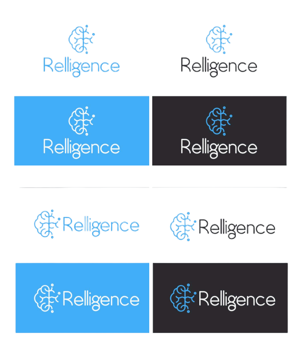
The Relligence™ logo is permitted on a Relligence™ Blue, Pure White, Daisy White, or Contrast Black (p. 17) background. The text can be altered to black or white, whilst the icon remains either Pure White or Relligence™ Blue.
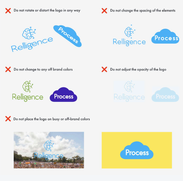
The logo must be on a solid background of any of the colors listed above, and should not be overlain on busy photos or off brand colors.
Process™
As our flagship product, Process™ transforms a piece of the Relligence™ logo into an airy cloud that encapsulates the word Process™
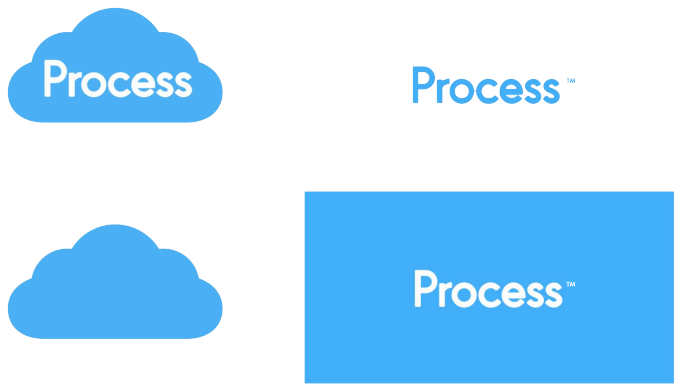
The icon and text may be separated, but the text must be on a solid background of either white or Relligence™ Blue. The cloud icon should only be used in small formats where the text is illegible.
Uses
The Relligence™ logo is permitted on a Relligence™ Blue, Pure White, Daisy White, or Contrast Black (p. 17) background. The text can be altered to black or white, whilst the icon remains either Pure White or Relligence™ Blue.
The logo must be on a solid background of any of the colors listed above, and should not be overlain on busy photos or off brand colors.
Clearance
If the Process™ or Relligence™ logos are placed with a partnering logo, our logos should be at least 1.5x larger.
The space around the logo should be at least 1/5 the width of the logo as a whole.
If the Procress™ and Relligence™ logo are both present in a strictly Process™ document, the Relligence™ logo should be half the size of the Process™ logo.
What to Avoid
The Relligence™ and Process™ logos should not be altered in any way. Refrain from recoloring, warping, or rotating the logo.
Logos should always remain in their original colors, and should not be placed on any busy or off-brand backgrounds.
Primary
Colors
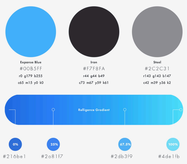
Expanse Blue, Iron, and Steel will be the dominant colors used across all platforms, typically on a Pure White, or Vision background.
The Relligence™ Gradient should only be used for introductory and promotional backgrounds and should not surpass Process™ Blue in use.
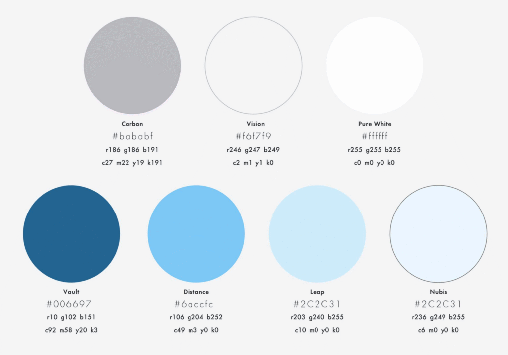
Secondary Colors
Secondary palettes will be used independently and in the form of supporting graphics.
These graphics include but are not limited to; vectors, patterns, hierachal typography, icons, or background.
Typography
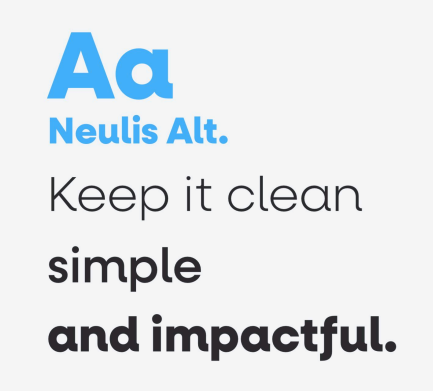
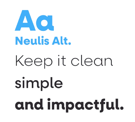
Neulis Alt. is round and geometric, successfully bridging the gap between the main font, Futura, and our logo typeface, Gusto.
Neulis should be used for headers and short impactful phrases. Headers longer than 6 words should alternatively use Futura Heavy, to ensure legibility and clarity.
Emblematic of its era, Futura inspired the modern age of type design. As the future of writing unfolds with Relligence™ and Process™, Futura is our perfection reflection as we usher in a new era of writing.
Futura Pt should be used in Light, Book, Medium, Demi, and Black
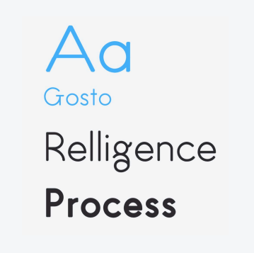
When it came to our logo, Gosto was a no-brainer. It’s flowing lines, impactful ‘g’, and modern yet fun style perfectly embodies our values.
Gosto should not be used for headers or copy of any kind. As the productivity suite expands, added logos will utilize Gosto, similar to the Process™ logo.
Relligence™ will use Gosto in a regular weight while the apps will use a bold weight